Most interesting hidden facts about 38 famous logos
1. Picasa:

Picasa, Google’s former image organizer and editor, has a logo that represents something through it. At a first glance it looks a simply a shutter of camera, but the negative space in the center of the shutter actually resembles like a structure of house. This is because Picasa is considered ‘home’ for all of its users' photos ('casa' of 'pic', and casa in Spanish also has a meaning i. e home. Most probably the brand name of the logo comes from the famous Spanish painter Pablo Picasso.
2. NBC logo:

When the NBC logo was designed color televisions were being introduced. So the multicolour of the logo represents the rainbow of colours, and the intention of this network was by their logo would cause the black and white tv owners to make their products switch from the b/w spectrum to the colour spectrum. In the logo their is a peacock also with its multi-coloured feathery tail which is used by them with the common phrase at the time, ‘proud as a peacock’, which promoted that they were proud of their new color system. The six different colors of the feathers of the peacock in this logo represent the six different divisions of NBC.
3. Baskin Robbins:
Baskin Robbins is famous for its 31 delicious flavors of ice cream. This famous number is hidden in the ‘B’ and the ‘R’ of their logo, acting as the curve of the ‘B’ and the stem of the ‘R’. The logo represents fun and energy, much like how one will feel during (and after) tasting their mind blowing flavours of ice cream. The amazing fact is the number, depicted behind the initial of the brand is actually 1312.
4. Cisco:
Cisco is a worldwide popular leading brand in networking for the internet. The headquarters of it is in San Francisco. While its namesake doesn’t have a hidden meaning in it, the blue stripes above the logotype not only represent an electromagnet but also, the Golden Gate Bridge of San Francisco.
5. Eighty 20:

Eighty 20 is a South African analytics consultancy. It has a logo which has meaning that can be solved by mathemetics. The squares actually represent the binary pattern for 1010000 and 0010100 which have decimal values of eighty and twenty respectively and this is what the company's name actually.
6. Le Tour De France

The logo of Le Tour De France has dual hidden meanings. The first message is of the logo is made up with both the letters 'u' & 'r' which resembles like a moving cyclist & this meaning is quite apparent but the second is a bit superficial. The dotted circle acts as the bike’s wheel, while the yellow circle is like a sun, indicating that the events of the race only occur in the daytime.
7. Beats by Dre :

In this logo 'b' is enclosed in a circle. The circle is not just a circle. It actually represents a human’s head, and the ‘b’ letterform represents the brand’s headphones. Behind this logo an impression is hidden which allows a customer of this brand to see themselves with the headphones.
8. Sun Microsystems

Sun Microsystems was a technological company & it has a diamond shaped logo. The logo consists of a bunch of wavy lines. This line actually represents ‘u’s and ‘n’s. Some of the letters are stacked on top of each other, creating the letter ‘s’. All of this put together spells out as ‘sun’ for a number of times.
9. AG Low:

AG Low, a construction company, has a simple logo. But it spells out its meaning in a unique way where it apperantly look like the floorplan of a home.
10. Milwaukee Brewers

This old logo for the Milwaukee Brewers looks like a baseball mitt catching a baseball. But if one carefully notice, he can observe the acronym of this brand i.e letters ‘m’ and ‘b’ which actually create the baseball glove.14. The visualization of this logo for a French clothing company is quite tricky. If one looks closely at the logo, he can read the logo exactly the same way when he read it from upside down. This implies that the company is innovative and their clothing can serve multiple purposes.
11.Spartan Golf Club

This logo for the Spartan Golf Club has couple of meanings. When anyone look at it one way, he may see a golfer taking a swing, with his trajectory displayed beside him & when anyone look at it the other way, he can see the profile of a Spartan in his helmet.
12. BirdLove

This logo for a vietnamese coffee shop is very simple in its black and white form & this typeface is a classic serif, and the heart symbol is clean. This reflects the integrity of the brand and its dedication to classic vietnamese coffee, as well as their love and passion for it. The two flying birds is hidden in the heart, bringing in its namesake.
13. LG

LG is wellknown worldwide, and most people recognize the ‘L’ and ‘G’ in the logo mark. What most people can not find out is, those letters actually help to create a face. The ‘L’ makes the nose and the ‘G’ makes up the rest of the face. This gives the brand a human element, and makes it more inviting and approachable. Infact the face of LG logo resembles like a face with a twinkling eye.
14. Audi

Audi is a car company which has a logo in which a meaning is hidden. The four rings in Audi represent the four companies that came together to create the original Audi, Auto Union.
15. My Fonts

My Fonts is an online font resource that allows its users to access a number of fonts from various font family. The ‘My’ in My Fonts is stylized to look like a hand, giving the impression that users can get their hands on whatever fonts they would like to use in their article.
16. Galeries Lafayette

Galeries Lafayette is an upscale French department store. The typography of its logo is elegant and fancy, but there is a twist in this logo. Actually the Eiffel Tower of Paris in France is hidden in the letter 'f’, which represents its French root.
17. Greenlabs
Greenlabs, a digital marketing and web solutions company, uses a tree in their logo. This accentuates the ‘green’ aspect of their brand, but another twist is the crown of the tree is actually a brain, which represents the intelligence of their staff and thereby support intelligence power of a research from a lab. So, both the colour & the shape of the tree together satisfy the company's brand name.
18. FedEx

FedEx is an incredibly popular shipping company, and its logo is quite simple in color & type, there is twist where, an arrow is hidden in the negative space between the ‘E’ and ‘x’. The arrow represents the idea of moving forward with speed and precision, much like the progression of FedEx brand.
19. Tostitos
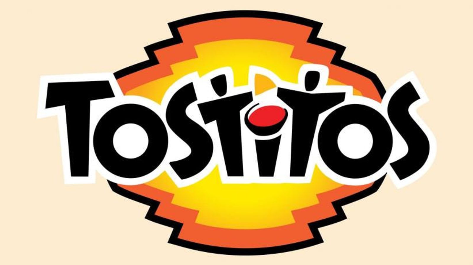
Tostitos, the popular chip and salsa brand, has some fun imagery hidden in its typography. The ‘tit’ in Tostitos is designed so uniquely that it actually represents two people enjoying chips and salsa at a table, where snack becomes the fun and social item in people's get together.
20. Carrefour

Carrefour logo has a meaning in French i. e. ‘crossroads’, the logo has two arrows on both the left and right sides which are in opposite direction to each other. The letter ‘C’ is hidden in the negative space between the two arrows, which stands for the brand name's first letter.
21. Gamecube
Gamecube’s logo is very interesting to look at. Not only is it a cube within a cube, but the outer cube forms a ‘G’ around the inner cube, leaving a ‘C’ in the negative space, that actually the acronym of the company's brand name.
22. Washington State University

Washington State University’s mascot is a cougar, which is their logo mark. The university’s initials, W, S, and U is subtly hidden in the cougar’s head.
23. Toyota
The popular car manufacturer, Toyota’s current logo has been around since 1990. The logo has three overlapping rings which actually symbolize the unification of the hearts of Toyota customers and Toyota’s products. The background space represents their technological advancement and the opportunities that lay ahead. The symbol of the logo consisting three overlapping rings can represent the full spelling of Toyota in a unique way.

24. Soni Vaio:

Sony Vaio(Visual Audio Intelligent Organizer) is known worldwide for its technology oriented products, but not everyone knows what its logo conveys us. Vaio represents the integration of both analog and digital technologies in its products. The letters ‘va’ are made to look like an analog wave, while the ‘io’ resemble the numbers 1 and 0, representing a digital signal or binary code. So, The logo of 'Vaio' actually represents the combination of analog & digital signal through its arrangement of letters.
25. Unilever

Unilever presents a number of products, and they exhibits their products using their brand name's first letter i.e 'U' which is composed of icons symbolizing their most popular core products.
26. Kolner Zoo

The Kolner Zoo in Germany’s logo has a number of symbols hiden inside it. In the contours of the elephant, a giraffe is there and a rhino is also present there. Hidden in the back legs of the elephant is the Cologne Cathedral, a famous local landmark. But it also resembles like ears of a rabbit.4. Amazon: Amazon is quite popular online shopping shopping portal has a meaningful logo. In fact its logo reflects its products availability. The yellow arrow in its logo is from the letter ‘a’ to letter ‘z’, implying that it sells its customers everything from a to z. The arrow also represents a smile, with the arrowhead being a stylized dimple or smile line. The smile indicates the customer feels happy after purchasing products from Amazon.
27. Pittsburgh Zoo & PPG Aquarium

This zoo logo resembles a simple tree at the very first glance. But if someone notice it very carefully in the negative space, he can observe the images of both a gorilla and a lion facing each other. This actually showcase the wildlife that can be found at the zoo.
28. Toblerone
The current logo of a popular company of chocolate bar, Toblerone has a logo which represents a mountain, symbolizing the Matterhorn Mountain in Switzerland. Inside the mountain one can observe a bear is hidden, that symbolize the unique honey flavor found in the chocolate and it reveals the fact that the chocolate is made in the ‘City of Bears’.
29. Adidas

Adidas, the popular sports apparel and shoe company has a logo which has three stripes. These three stripes are always a part of their logo, but in their most recent redesign, the stripes are staggered to look like a mountain. The mountain represents the challenges and obstacles athletes will face and overcome by using the Adidas products.
30. IBM

IBM’s famous logo is recognized worldwide. The white stripes passing through the letterforms give the illusion of equal signs in the lower areas of the letters, which represents equality.
31. Google

Google’s logo symbolize that they don’t play by the rules and know how to have fun. Instead of having a crazy font or symbol, they chose to relay their message with color. They stuck with the primary color palette but broke it with a secondary color, green.
32. Continental

The hidden meaning in Continental Tire’s logo is none other than a tire. The ‘C’ and the ‘o’ are closely placed together, with the ‘C’ wrapping around the O, which actually create the shape of a tire in a very unique way.
33. Gillette

Gillette, a razor company, is razor sharp with their logo — literally. The intricate and precise cut in the ‘G’ and ‘i’ look as though they have been carefully removed with an extra sharp Gillette razor.
34. Wikipedia

It's not surprising that the worldwide encyclopedia's emblem is Earth. The logo of Wikipedia consists of the puzzle pieces of symbol of multilingualism, so each is labeled with letters of different languages. Taken together, they make the word "wikipedia," while the missing pieces indicate that the encyclopedia isn't finished and is constantly being updated.
35. Atlanta Falcons

Atlanta Falcons is a professional American football team based in Atlanta. This sports team uses a image of a falcon as their mascot. So in their logo the falcon is in the shape of an ‘F’, representing the Falcons in more than one way.
36. Apple

There is a legend behind the logo of the famous Apple company. It has been told that the Apple logo was dedicated to Alan Turing, who ended his life by biting into a poisoned apple. In fact, it's all much simpler: designer Rob Janoff says he made the bitten apple to show its dimensions because a whole apple can be easily confused with any other round fruit. Another fact is a bitten apple symbolize the knowledge gathered by human, as in Bible apple represents the fruits from the tree of knowledge.
37. Pinterest

Pinterest got its namesake from the idea of ‘pinning’ things one like to a board. from the idea of the pin, the ‘P’ represents a pushpin. This brings together the real life aspect of tacking something to the wall and also doing it in the digital age.
38. Hope for African Children Initiative

At first glance, this logo appears to simply be the geographical outline of Africa. But if someone look more closely, he can observe that this outline is actually created by the contours of two people – a mother and a child facing each other.


No comments: